Original: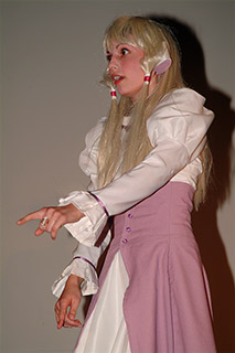
I want this image brighter to get a cartoonish feel, and to make her skin and hair look more smooth.
|
|
Photoshop: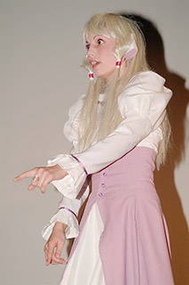
Photoshop makes her pale and exaggerates the color in the shadow.
|
|
SuperSat: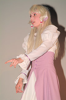
Super Saturation maintains the colors in her skin and clothes, without boosting the
color in the shadow too much.
|
Original: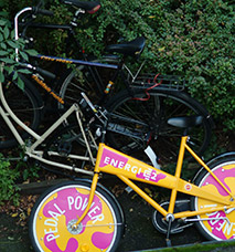
Again a scene that i had to photograph rather darkly to avoid over exposing the bike.
|
|
Photoshop: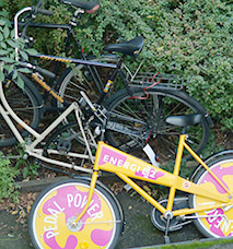
Photoshop makes the bike pale.
|
|
SuperSat: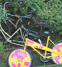
Super Saturation retains the colors on the bike without exaggerating the green color on the bushes.
|
Original: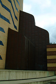
The dark part of the building is almost drowning in darkness.
|
|
Photoshop: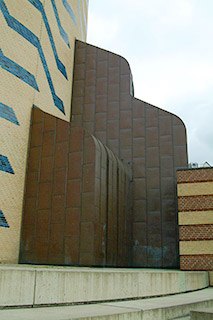
Photoshop takes the blue away from the sky and adds too much color to the brow parts.
|
|
SuperSat: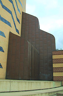
With Super Saturation the colors get much closer to what this motives actually looked
like to the naked eye.
|
Original: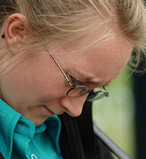
This image is not really too dark or bright, but i'll try changing it anway, for
demonstration purposes.
|
|
Photoshop: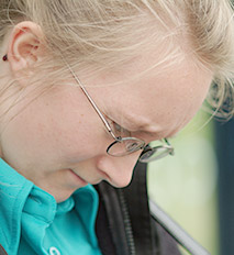
Notice how the color of her shirt is unnaturally over saturated, and at the same time
she has lost some color.
|
|
SuperSat: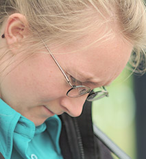
With Super Saturation color amount is prevailed.
|
Original: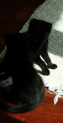
This is one of the tricky images. Exposing anymore would have killed details in the
carpet. But the kittens are almost completely black. Again, gamma correction is the
solution.
|
|
Photoshop: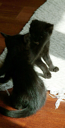
Photoshop pulls out more color in the floor - too much in the top part if you ask me.
The more yellow/orange color is nice though.
|
|
SuperSat: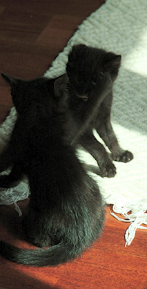
Hair detail in the fur is much more natural here though.
|
Original: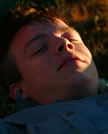
Portraits with high contrast are also a challenge.
|
|
Photoshop: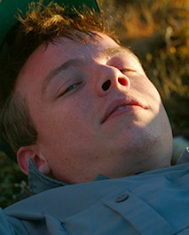
The difference between the two images are not that obvious.
|
|
SuperSat: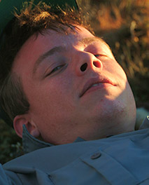
The sunlight keeps more of it's original warm color, which corresponds with the actualy sitation.
The image is taken at sunset.
|
Original: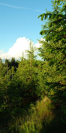
Now this last image also didn't really need being made brighter, but again i'm doing so
to show what would happen if i did.
|
|
Photoshop: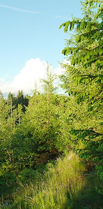
The green color is boosted - especially in the shadows. Now this could be a matter of taste.
The sky is somewhat pale now.
|
|
SuperSat: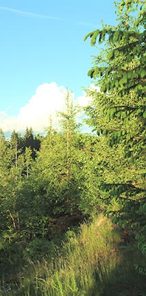
The trees are less green, and you might prefer
them to be more colorful. Of course, this could be achieved by increasing the saturation.
For these examples i wanted to use the gamma only, to display the difference.
|